Project Overview
Background
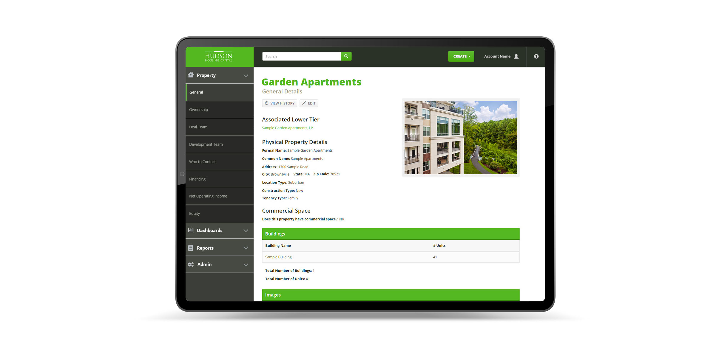
Hudson Housing engaged us to design and develop their Asset Management System thast would be primarily used on a tablet my their team members when they are on-site at their property locations. Due to an NDA I am not allowed to show more of the app than the sample below.
Project Date
Spring 2017My Role
- UX Design
- UI Design
- Front-End Development
The Challenge
To create a web application for investors to track, monitor and manage financial information about various housing sites and properties.
The Process
Understanding the User
We spent a lot of time up front and throughout the design process interviewing the stakeholders and primary users of the current system to get an understanding for how key features of the application would function and what were most important in their day to day life. What they liked about their current system, what they hated, and what they would like to see added all factored into how we structured the layouts and the overall IA. Quite often there were contradictions in how some users felt features should behave and part of my job was to walk through the decisions we made from research gathered to provide the best possible experience.
Data visualization and information organization were the most important aspects of this project. There were obscene amounts of data that needed to be readily available and easily accessible at all times, and part of my role was working with the client to help guide them away from their current old & familiar disorganized layouts to updated and more usable ones.
Wireframing
After our research was complete we began to write our user stories to explain how certain components of the app would function depending on what type of user you were (admin, investor, etc). To go along with each story, I created a low-fidelity interactive wireframe so a user could test to make sure the functionality and user flow made sense and aligned with their goals.
Design & Prototyping
As the blueprints of the app started to take shape, we started focusing on visual design. For this project we decided to use style tiles to illustrate the design direction because it was not a design-heavy application. I mocked up several different examples with different color palettes and components for the client to see.
After the overall design was established, I set up my base styles/markup and built the style guide that we would use for this project (a sample styleguide for this project may be found here.) I then began to build the components and layouts that we identified in the wireframes and user stories. The order I progressed through was determined by our agile task board, and as items were completed on my end I would work closely with our back-end developers in separate branches of a Git repo to bring each section to a functional and logical working state.
We used and modified chart.js to help us with our data visualization for certain pieces and designed responsive faux tables that would display differently depending on what we were presenting for our tabular data.