Project Overview
Background
Instant Open, Salem Five's account opening tool, is another application that I am heavily involved with making improvements to and has undergone some very major interface and user experience enhancements since I began working here. This is the tool every user who opens an account online with the bank uses, so making the path easy to navigate while providing all the necessary information is extremely important.
Project Date
Winter 2019My Role
- UX Design
- UI Design
- Front-End Development

The Problem
The first problem that needed to be solved was the account opening journey. The bank touted in their slogan and ad campaigns that they take complication out of the banking process and keep everything simple, yet the entire account opening process was overly complicated. Every page contained a novella of things a user may or may not need to do, and not all of the information was relevant to the required actions on a page. The progress bar barely moved after completing each page leaving a user wondering just how far along the process they actually were, seeing as this process was supposed to be "quick" yet seemingly dragged on and on.
The second problem was the branding and UI. A user's journey would jump from being on the Salem Five website to somewhere that looked nothing like where they previously were. Fonts and colors were different, page layouts were inconsistent, the only thing that remained constant was the logo and the blue header that matched the old website.
Research
After meeting with the project stakeholders, we first identified the goals: to simplify the user's journeys and to make the transition from the website to account opening feel less jarring. We started by mapping out paths for new users, existing users and user's who started an application but did not complete the process. After this was established, I was able to either consolidate pages or eliminate them entirely and make the journey much more clear and concise.
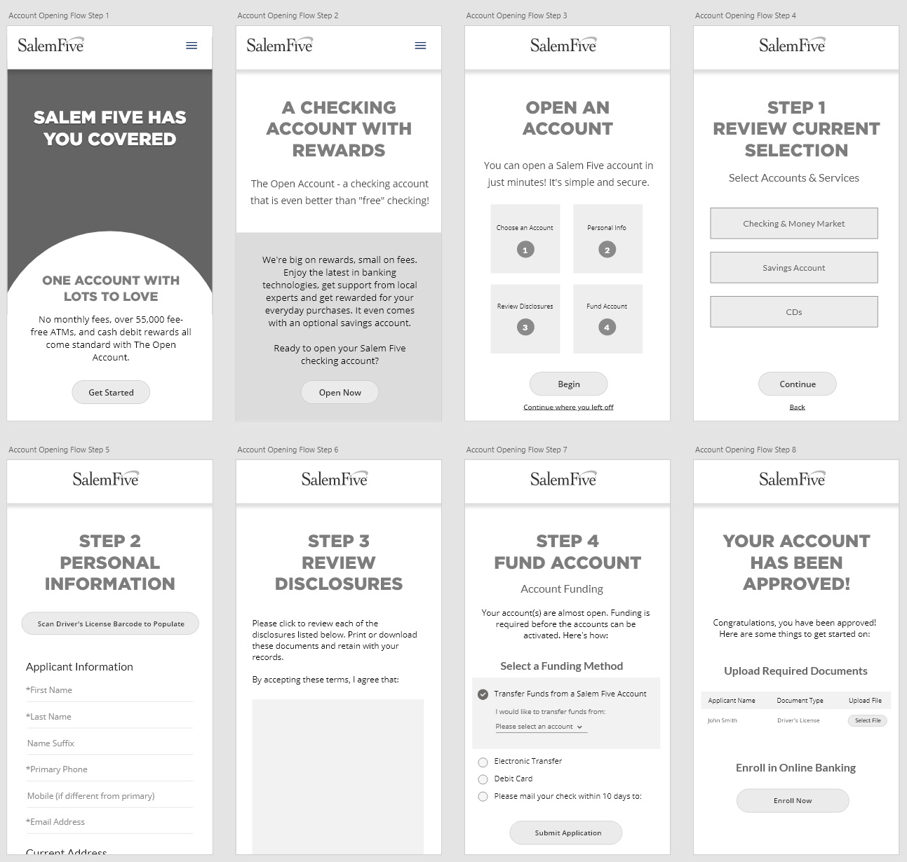
Wireframes for the account opening flow of a new applicant
Design & Prototyping
With a simplified journey, I was able to make enhancements to the progress bar changing it from being extremely ambiguous to 4 clear steps. I redesigned the landing page to be more straightforward in guiding users to their destinations and highlight what the steps through the process are. Forms were redesigned so labels were not covered up after a user started typing in a field, and they were reorganized to appear less lengthy and easier to fill out. Overall the process became quicker to navigate through and less confusing for a user, which translated to less applications being abandoned or left to be completed at a later date.

Outcomes
With regards to the account opening process, our survey scores have improved for all of the following measures: Overall Satisfaction, Ease of Use and our Net Promoter Score (NPS).
For online account openings, positive commentary in Q2 2021 outweighed negative commentary for the first time, and more customers were likely to make more than one positive comment per survey for only the second quarter ever since the survey's inception in Q3 2018.
When we incorporated new and streamlined measures within our new account opening process in Q1 2020 and saw a marked increase in all three measures in Q2 2020 for Virtual, scores briefly dipped in Q3 & Q4 2020, but bounced back in Q1 & Q2 2021. In a nutshell, the amount of negative feedback has gone down & the amount of positive feedback has gone up over time.
We continue to make regular improvements to our account opening process and have received a great deal of praise internally, from customers, and even from competitors for the changes that we have made.
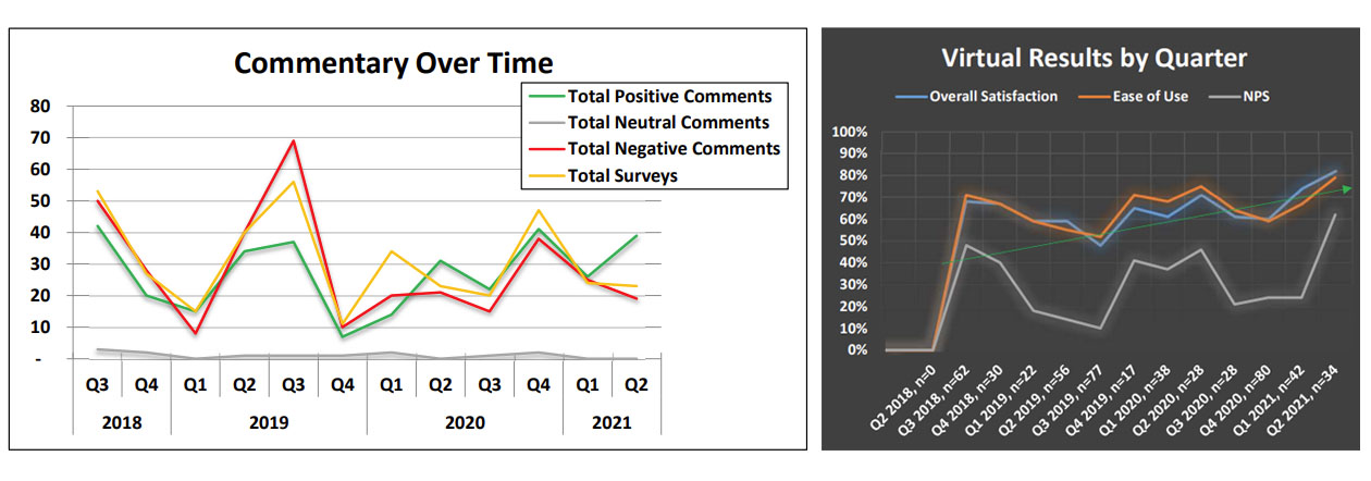
Results from our customer surveys